So I had my first letterpress class yesterday.
It's a good thing we're planning to move outta the city soon to a place with more space, because I've been trying to figure out how to get several cases of lead type and a machine weighing in at over a ton into my apartment. (I'll probably have to settle for a tabletop platen press or simple tabletop proof press, but hey, a girl can dream...of barns with concrete foundations. O the boom it would take to relocate such a beast!)
In other words: bitten, smitten, hooked, lined, and sunk.
I arrived at the Center for Book Arts fifteen minutes early (if you know me, you know I generally err on the other side of the appointed hour), ready to jump in and get started with Letterpress I, lead by Nancy Loeber. Oops. Somehow I flubbed the class info and managed to be almost an hour late: the official class start time was 10 A.M. (I registered back in December for the March class, but then had to postpone because of AWP. Six months later, the details were foggy.) A trip through the main gallery (where there's a really interesting soap-opera comics exhibit up right now) brought me to the printshop, in a wide, lofty room, sectioned by shelving, with 5 or 6 big letterpresses along a wall of tall windows. In one corner, a guy was cutting leather for a binding class going on simultaneously in the bindery, on the opposite side of the main gallery.
Six other students (all mid 20s-mid 30s women) were already setting type for our first group project, an abecedarium based on an old children's book. Nancy kindly ran through, in abbreviated form, what I had missed in the first 45 minutes, and introduced herself (she's been letterpressing and bookbinding for 6 yrs. and teaching for several of those). She handed me a type case map with a pica-spacing chart as a visual aid, a composing stick with an accompanying knee, and briefly summed up the project. She pointed out where the spacing materials were kept. For kerning between words there are slugs, for leading between lines, leaders, and for filling out lines for a really tight block or indentions quads (lead blocks), brasses (thinner and of brass) and coppers (thinnest yet). When she asked me about my background and related experience, I told her I'd worked as a book designer so we skipped the typeface and pica/point talk--that helped catch me up quicker. (I also told her I was a poet, and bless her, she actually looked pleased.) The letters Y and Z fell to me, the only two left.
Around the central large work table were flat-files with type cases as drawers. I chose Caslon 18 pt. (Follow that link and scroll down a bit for a Caslon sample and design notes. Caslon is a classic typeface for book printing, but I wanted a big-enough point size to hold its own on a broadside, like the one we were making.) I lugged the type case to the table & started setting my first line.
 The composing stick is a tray with high sides on the bottom and right and open at the top and left. The top is ruled, and the removable knee slides along the bottom edge and has a tension lever to help you keep your set type in place as you compose. One begins at the top of a block of type, setting the type with the letters upside down. My first line to set, then, was the penultimate line of our poem, the one for the letter Y. (I'd missed the part where Nancy said we could make up new text for our letters if we chose, so I just followed the book. Even though I hadn't read the rest, I could tell from this line, the object of the book was not only to teach the alphabet, but to entertain via rhyme and rhythm, as well as function as a kind of which-of-these-does-not-belong game.) Going from left to right, but facing my letters upside down and looking at their backwards forms, I composed: YELLOWHAMMER, Eagle, Hyena, Lark. Conveniently, the line and spacing I chose fit perfectly on the 30-pica (that's 12.7 centimeters) limit Nancy had set.
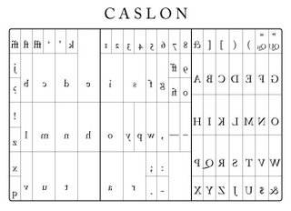 I stacked up a couple of leaders, for space between the lines, and set my second line: ZEBRA, Chamelon, Butterfly, Shark. The type case map was extremely handy for us newbies. Think of it kind of like a keyboard: the letters are arranged in positions related to their frequency of use. Vowels get bigger cubbies--with the lowercase e getting the biggest, and numbers and skinny letters like lowercase l make their homes in narrower pockets. (Luckily, the type case maps Nancy gave us were not printed with reverse images of the letters like the example above. It's tough enough to be sure you're spelling chameleon correctly upside down and backwards without having to use a topsy-turvy case map! Soon enough, we'll all be reading backwards. I may even take up mirror writing.)
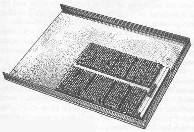 Since I only had two lines to set (others had 4), I also set the X and W lines, just for more practice judging spacing to fill out lines and to get more familiar with the type case. My fingertips were grey, at this point, from the metal and probably ink residue (though the type is cleaned with alcohol after each use). Everybody finished up around the same time, I pulled my two extra lines and sorted the type back into the case. Nancy came around with a galley--a tray to collect all the set type. It's got raised rims on all but one side, and holds your composed type as you arrange it in a completed block, tranferring a few lines at a time from your composing stick. Then we learned how to tie the block, wrapping twine around the outside of the type (while it was still on the galley) and tucking one corner with a copper. We transferred the block to the bed of the press and broke for lunch.
[An aside: WTF is the deal with roving salesmen in urban parks? I'm not sure if it was Our Lord or something else I didn't want to hear about right then, but dude-in-a-crisp-white-shirt-and-tie, when I'm chowing down on my seven-grain-and-smoked-turkey sandwich in Madison Square park gazing at (my fave) the Flatiron Bldg., it's just not a good time.]
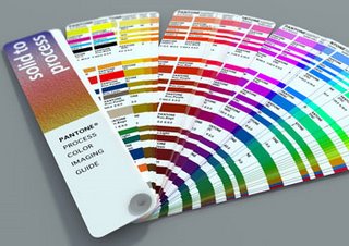 After lunch, Nancy showed us the shelves where the rubber-based ink for the letterpresses are kept. The colors are organized on a Pantone system! Very groovy. She opted for basic black as a demo, and showed us the ink's body, moving it around on a plexiglass plate with a palette knife. It's very thick, and a little goes a long way.
Then we went over the parts of the press, learning the names for each part and how to engage the rollers, how to change the tympan paper (which is heavyweight and oiled on one side) and packing sheets underneath (which can be adjusted according to how much impression you want to make in the paper), how to set the grippers and roller heights, how to center the paper on press, and of course how to set up the block of type on the bed, using funiture (wooden bars--though they also make metal ones) reglets (smaller, but similar), the quoin and quoin key, and the lockup bar (kind of like the knee on the composing stick, but for the press bed, with a tension lever to hold the block and all the furniture in place on the bed). [For pics for some of these items, see this glossary.] Finally, we were ready to print!
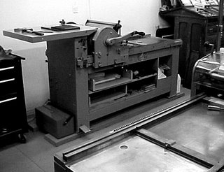 I forgot to note the model number, but we were using a Vandercook, similar to the one at left. It's got two sets of rollers, in addition to the tympan cylinder, which carries the paper. Nancy inked the press by dotting just a teeny bit of ink from the corner of her palette knife (this may have a more official name in printing, but it's a basic putty or palette knife with a flat squared shape, maybe an inch or so wide) onto the smallest front roller, which is metal. She flipped the switch for the roller motor (the press is cranked by hand, but the rollers are motorized to enure even inking) and the ink from the small front roller was transferred to the larger metal roller, the one that will come into contact with the type on the bed. Then she ran a couple of test prints, and showed us on each how to look at the impression on the back of the paper (apparently fine letterpress artists used to try to minimize the impression, but people came to value the raised effect on the back of the letterpressed page as a distinctive quality!), and where we might need to tighten lines with brasses and coppers or replace type that was worn or nicked. A couple of folks got letters like S's and O's upside down. She adjusted the height of the rollers and showed us how to measure roller height with a metal tool called a lollipop. The rubber rollers determine the amount of contact and pressure between the paper and the inked letters. Some of our letters were coming out faint or not inked at all, but the impression was good, so we knew we had enough packing (paper padding on the tympan) but needed the rollers to be adjusted. After 5 or 6 test prints, everything was set to her liking, and we each took a turn cranking the press. (Did I mention we signed liability wavers? Yeah, you could injure yourself on one these things, but they're really not all that scary.)
 I printed this broadside. If you look at the third staza closely (click for a larger jpg), you can see the O in LION is actually a zero. Some of the s's and o's elsewhere are upside down, one O is nicked, and at least one person got hold of a missorted case (that's a case of "pied type") with a nonmatching r. Still, I think we were unanimously thrilled.
We spent the remaining classtime rummaging through type cases and flat files, designing our first individual projects, which we'll start today. I'm going to print up a small broadside of my poem "The Woman from the Public" since it has alternating lines of roman and italic type. That'll make an interesting print, I think.
Before I go, here's a link to the wonderfully thorough Five Roses letterpress site, by letterpress printer and graphic designer David S. Rose. (Nancy recommendeds it highly.) & also, you should check out some of Nancy's work at the CBA's bookstore, here. I fondled so many beautiful things yesterday I felt positively lecherous.
In other words: bitten, smitten, hooked, lined, and sunk.
I arrived at the Center for Book Arts fifteen minutes early (if you know me, you know I generally err on the other side of the appointed hour), ready to jump in and get started with Letterpress I, lead by Nancy Loeber. Oops. Somehow I flubbed the class info and managed to be almost an hour late: the official class start time was 10 A.M. (I registered back in December for the March class, but then had to postpone because of AWP. Six months later, the details were foggy.) A trip through the main gallery (where there's a really interesting soap-opera comics exhibit up right now) brought me to the printshop, in a wide, lofty room, sectioned by shelving, with 5 or 6 big letterpresses along a wall of tall windows. In one corner, a guy was cutting leather for a binding class going on simultaneously in the bindery, on the opposite side of the main gallery.
Six other students (all mid 20s-mid 30s women) were already setting type for our first group project, an abecedarium based on an old children's book. Nancy kindly ran through, in abbreviated form, what I had missed in the first 45 minutes, and introduced herself (she's been letterpressing and bookbinding for 6 yrs. and teaching for several of those). She handed me a type case map with a pica-spacing chart as a visual aid, a composing stick with an accompanying knee, and briefly summed up the project. She pointed out where the spacing materials were kept. For kerning between words there are slugs, for leading between lines, leaders, and for filling out lines for a really tight block or indentions quads (lead blocks), brasses (thinner and of brass) and coppers (thinnest yet). When she asked me about my background and related experience, I told her I'd worked as a book designer so we skipped the typeface and pica/point talk--that helped catch me up quicker. (I also told her I was a poet, and bless her, she actually looked pleased.) The letters Y and Z fell to me, the only two left.
Around the central large work table were flat-files with type cases as drawers. I chose Caslon 18 pt. (Follow that link and scroll down a bit for a Caslon sample and design notes. Caslon is a classic typeface for book printing, but I wanted a big-enough point size to hold its own on a broadside, like the one we were making.) I lugged the type case to the table & started setting my first line.
The composing stick is a tray with high sides on the bottom and right and open at the top and left. The top is ruled, and the removable knee slides along the bottom edge and has a tension lever to help you keep your set type in place as you compose. One begins at the top of a block of type, setting the type with the letters upside down. My first line to set, then, was the penultimate line of our poem, the one for the letter Y. (I'd missed the part where Nancy said we could make up new text for our letters if we chose, so I just followed the book. Even though I hadn't read the rest, I could tell from this line, the object of the book was not only to teach the alphabet, but to entertain via rhyme and rhythm, as well as function as a kind of which-of-these-does-not-belong game.) Going from left to right, but facing my letters upside down and looking at their backwards forms, I composed: YELLOWHAMMER, Eagle, Hyena, Lark. Conveniently, the line and spacing I chose fit perfectly on the 30-pica (that's 12.7 centimeters) limit Nancy had set.I stacked up a couple of leaders, for space between the lines, and set my second line: ZEBRA, Chamelon, Butterfly, Shark. The type case map was extremely handy for us newbies. Think of it kind of like a keyboard: the letters are arranged in positions related to their frequency of use. Vowels get bigger cubbies--with the lowercase e getting the biggest, and numbers and skinny letters like lowercase l make their homes in narrower pockets. (Luckily, the type case maps Nancy gave us were not printed with reverse images of the letters like the example above. It's tough enough to be sure you're spelling chameleon correctly upside down and backwards without having to use a topsy-turvy case map! Soon enough, we'll all be reading backwards. I may even take up mirror writing.)Since I only had two lines to set (others had 4), I also set the X and W lines, just for more practice judging spacing to fill out lines and to get more familiar with the type case. My fingertips were grey, at this point, from the metal and probably ink residue (though the type is cleaned with alcohol after each use). Everybody finished up around the same time, I pulled my two extra lines and sorted the type back into the case. Nancy came around with a galley--a tray to collect all the set type. It's got raised rims on all but one side, and holds your composed type as you arrange it in a completed block, tranferring a few lines at a time from your composing stick. Then we learned how to tie the block, wrapping twine around the outside of the type (while it was still on the galley) and tucking one corner with a copper. We transferred the block to the bed of the press and broke for lunch.[An aside: WTF is the deal with roving salesmen in urban parks? I'm not sure if it was Our Lord or something else I didn't want to hear about right then, but dude-in-a-crisp-white-shirt-and-tie, when I'm chowing down on my seven-grain-and-smoked-turkey sandwich in Madison Square park gazing at (my fave) the Flatiron Bldg., it's just not a good time.]
After lunch, Nancy showed us the shelves where the rubber-based ink for the letterpresses are kept. The colors are organized on a Pantone system! Very groovy. She opted for basic black as a demo, and showed us the ink's body, moving it around on a plexiglass plate with a palette knife. It's very thick, and a little goes a long way.Then we went over the parts of the press, learning the names for each part and how to engage the rollers, how to change the tympan paper (which is heavyweight and oiled on one side) and packing sheets underneath (which can be adjusted according to how much impression you want to make in the paper), how to set the grippers and roller heights, how to center the paper on press, and of course how to set up the block of type on the bed, using funiture (wooden bars--though they also make metal ones) reglets (smaller, but similar), the quoin and quoin key, and the lockup bar (kind of like the knee on the composing stick, but for the press bed, with a tension lever to hold the block and all the furniture in place on the bed). [For pics for some of these items, see this glossary.] Finally, we were ready to print!
I forgot to note the model number, but we were using a Vandercook, similar to the one at left. It's got two sets of rollers, in addition to the tympan cylinder, which carries the paper. Nancy inked the press by dotting just a teeny bit of ink from the corner of her palette knife (this may have a more official name in printing, but it's a basic putty or palette knife with a flat squared shape, maybe an inch or so wide) onto the smallest front roller, which is metal. She flipped the switch for the roller motor (the press is cranked by hand, but the rollers are motorized to enure even inking) and the ink from the small front roller was transferred to the larger metal roller, the one that will come into contact with the type on the bed. Then she ran a couple of test prints, and showed us on each how to look at the impression on the back of the paper (apparently fine letterpress artists used to try to minimize the impression, but people came to value the raised effect on the back of the letterpressed page as a distinctive quality!), and where we might need to tighten lines with brasses and coppers or replace type that was worn or nicked. A couple of folks got letters like S's and O's upside down. She adjusted the height of the rollers and showed us how to measure roller height with a metal tool called a lollipop. The rubber rollers determine the amount of contact and pressure between the paper and the inked letters. Some of our letters were coming out faint or not inked at all, but the impression was good, so we knew we had enough packing (paper padding on the tympan) but needed the rollers to be adjusted. After 5 or 6 test prints, everything was set to her liking, and we each took a turn cranking the press. (Did I mention we signed liability wavers? Yeah, you could injure yourself on one these things, but they're really not all that scary.)I printed this broadside. If you look at the third staza closely (click for a larger jpg), you can see the O in LION is actually a zero. Some of the s's and o's elsewhere are upside down, one O is nicked, and at least one person got hold of a missorted case (that's a case of "pied type") with a nonmatching r. Still, I think we were unanimously thrilled.We spent the remaining classtime rummaging through type cases and flat files, designing our first individual projects, which we'll start today. I'm going to print up a small broadside of my poem "The Woman from the Public" since it has alternating lines of roman and italic type. That'll make an interesting print, I think.
Before I go, here's a link to the wonderfully thorough Five Roses letterpress site, by letterpress printer and graphic designer David S. Rose. (Nancy recommendeds it highly.) & also, you should check out some of Nancy's work at the CBA's bookstore, here. I fondled so many beautiful things yesterday I felt positively lecherous.
Labels: letterpress
posted by shanna at
5:45 AM
![]()
![]()


3 Comments:
What a wonderful overview! Thanks for sharing. It makes me wanna muck in and get inky!
By Ivy, at 12:18 PM
DAMN this looks like fun!
By Kasey Mohammad, at 12:39 PM
Thanks for the generous share, Shanna! I heart this new vocabulary!
You should learn this all and then come to Southern Oregon (and actually make it over the mountain) and teach us all a thing or two.
By jess rowan, at 4:13 PM
Post a Comment
<< Home