Elsewhere: What is your book cover trying to tell us

Gary Sullivan has spent the last few days looking at poetry book design on his blog Elsewhere, examining some of the cliches and conventions of covers. Something for DIYers to consider, since many of us do the designing ourselves.
Part 1
Part 2
Part 3
Part 4
Part 5
Part 6
A few related posts on other blogs:
K. Silem Mohammad at Lime Tree
Elisa Gabbert at Pshares
Peter Davis at Hitler's Mustache & again (NB: I love Peter's cover, as well as the book it wraps.)
Clay Banes at Eyeball Hatred
François Luong at Voices in the Utter Dark
I'm sure I've missed some? And check out this cool assembly of small press book covers pulled together by C. E. Putnam (from which the image above is clipped, gracias).
In addition to a bunch of the same things mentioned by these folks--especially the Big Game stuff, Katie Degentesh's The Anger Scale from Combo Books, James Meetze's designs for Tougher Disguises--here are a few covers I think work particularly well:

That's Johannes Göransson's A new quarantine will take my place, from Apostrophe. (NB: Dear Apostrophers, that link to JG's book page is
I'm already revealing a personal preference, no? A bold, flat, graphic style--a little pop, a lot mid-century mod, a palette of primaries or brights, "clean" designs with lots of space. (Well, that's one kind of thing I like.) Another example: I've always really liked the look of Toner by Ron Silliman. Annoyingly, there's not a single jpg of it anywhere on the internet. (WTF?!) It's a flat red-orange ground with TONER in yellow about a third of the way down, a pyramid of yellow dots (like a rack of billiard balls, but just 6 in a 1, 2, 3 formation) and his name in yellow below. The back is flat yellow with red-orange type. (Potes & Poets.)
Update: Ron comments to offer this jpg (thanks!), says he designed this one himself (cool), and explains that what I called billiard balls is the low-toner symbol from some copy machines. (Never seen that myself--the copiers I've wrestled just say it in lame prose. Heh.)

These next two are by Jeff Clark, a.k.a. Quemadura, already mentioned several times in the posts and comment streams above.

(So, yeah, I'm a fan, as I'm sure I've mentioned here or on my main blog before. I think Quemadura designs sometimes overuse italics tho. And Clark has a distinctive style--maybe too distinctive? His designs are recognizably his, sometimes to the point of distracting from the press branding or inherent book identity--the book sometimes feels more like a Jeff Clark product than that of the press or the author. Am I making sense? There's no denying that the books are beautifully done, and individually they are knockouts.)
Anyway, what I like about these John Clare books is first that they work well together as a set (though they are sold separately). The paperback design (I haven't actually seen in person the hardcover shown here) takes the classic "portrait painting of a dead author" convention and infuses it with with contemporary feeling, by using halftone screening and clever cropping. At the spine, the portrait wraps and continues without the screening (so as it appears on the hardcover) after a "violator" bar containing the spine copy. I don't have a shot, but that puts a seductive slice of the poet's face on the spine--most of an eye, his handsome nose and slightly parted lips. Spines are usually so spare--mainly because poetry books are so thin. On the back, a bare hint of hair, facial contour and half an eye peeks in from the edge. Even though the portrait itself is very lovely, the usual treatment of slapping it centered on the cover would have placed this paperback square in boring dead-author territory. This would be hard to repeat, however. Or rather, too easy to repeat.
Which brings me to my next point. I go back and forth on the "series design" idea for much the same reason I sometimes find the Quemadura "house style" a little distracting. The uniformity of the City Lights pocket books, the textured & uncoated Black Sparrow covers, or the New Direction B&W covers work as a branding device for sure--very effective. The templates are hot, but the resulting coherence tends to overemphasize the press identity rather than say anything about the books/authors themselves, to my mind. This is less important with reprints than with first editions--so for the Penguin Classics or Everyman's Library, etc.--this kind of thing seems fine. It also works fine for Vintage (under the direction of Chip Kidd?) on their Black Lizard crime novel series and other stuff like the Philip K. Dick catalog. One of my favorite series: these old-school Penguins, yum.
I can think of at least one instance where the poet & poems come through, being supported rather than muted by a series design. David Trinidad's books from Turtle Point: Hand Over Heart, Answer Song, Plasticville, etc. They share certain elements--poppy colors, stripes, an op-art kind of flatness. Unfortunately I can't find a pic of Hand Over Heart or find my copy in this mess right now--but it's black with a hot pink heart and some stripes if I remember correctly. Even his new book, The Late Show incorporates some stripes, while moving away from the flat graphics to a sketchier, warmer style:


My favorite book designer is Charlie Orr. Of course, he's one of my very best friends and a huge influence on my own design sensibility, so I'm plenty biased! I should post a bunch of Charlie's designs, but it will have to wait for another post. I've dawdled here long enough today.
What are your favorites?
Labels: Apostrophe, Big Game Books, book design, Combo Books, Potes/Poets, Quemadura, Tougher Disguises
posted by shanna at
9:29 AM
|
6 comments


 New from Dusie Press, Logan Ryan Smith's The Singers! Kevin Killian gushes, "Music and its family of allied arts reigns high in the world Logan Ryan Smith has carved for his Singers. Dance and ritual act as counterforces to the martial law the poem has been written under, in this time of Iraq incursion that touches every aspect of our lives. Smith sends out these poems like bulletins to his heroes, his confreres, his girlfriends, his dead; in the serial form pioneered by Jack Spicer, John Ashbery, Robin Blaser, and Larry Kearney, the tropes rumble like card tricks—Spicer’s forests, diamonds, Giants and knights advance and retreat across a musical chessboard. If there was no one else writing poetry in all of the Bay Area, we would still be 'covered'; with Logan Ryan Smith at bat we’ll see angels in the outfield." Enough said.
 As of yesterday, Maureen Thorson's Big Game Books has unleashed another set of tiny yet powerful poetry in the form known as tinysides. "Tinysides 31-35: Games We Play to Win: The seventh installment of the tinysides series shows the value of luck and persistence. Our authors play their games to win. First up, and with aces in the hole, Jenna Cardinale brings us tales of infinitive advantage, and the pleasure of reversals. Next up to bat, Jordan Stempleman celebrates the strength of muscle and the unnerving statistical powers of monkeys, shipwrecks and healing. Ivy Alvarez follows coyly behind, with a basketful of solutions to life's most intractable problem -- itself. Lars Palm knows that even in the midst of life, there are Spanish pop songs, and the fun of phonemes. Finally, Michael Comstock brings up the rear, and wants you to know why he likes you. He really does. Really. As usual, Tinysides are the cheapest form of poem around. A buck a pop, or all five for a mere $4.50. (S&H runs you about $1.00)." These little goodies go fast, so don't delay.
 Looky there: Amy King was recently elected Poet Laureate...of the Blogosphere. Even more importantly, she's got a new book out, which I haven't yet picked up. Let this note serve as my reminder and yours too. Says Linh Dinh, "These poems are meditative, subtle and deeply human, but beneath their cool, often gorgeous surfaces are darker currents, 'holes firing lyrics, free range.' Amy King 'pimps the abyss,' and she's not joking. Better kiss your 'trucker state' goodbye." Well all right. ISBN:1-934289-33-7, 7 x1o, 87 pp., perfect bound. $16. Available from Blaze-VOX
 This one's been out a while, but somehow I missed it until yesterday, despite its author being a coeditor here, ahem! Sandra Simonds' The Humble Travelogues of Mr. Ian Worthington, Written from Land & Sea can be obtained from Mark Lamoureux's Cy Gist Press for $6
 Bill Allegrezza of Cracked Slab Books announces the release of The City Visible: Chicago Poetry for the New Century. "It's an anthology of some of the best innovative poetry being written currently in Chicago. Peter Gizzi says of it, 'When Carl Sandburg asked in his Chicago Poems, close to a hundred years ago, for 'a voice to speak to me in the day end, / A hand to touch me in the dark room / Breaking the long loneliness,' little did he know his city would be so fully and livingly answered and so honored. Chicago is again transformed by poetry. Here in these myriad acts of imagination, the poets of The City Visible give to it again, in Shakespeare's terms, 'local habitation and a name.'" ISBN: 0-9786440-1-8. Perfect bound. 254 pp. Edited by W. Allegrezza & R. Bianchi. $22.95.
 The first issue of Andrew Lundwall's new e-zine,
 Last and least, I forgot to (duh) mention here the article I wrote for the Poetry Foundation website on how blogs have changed poetry publishing. Peruse it
 What's that sound? That mad buzz, that rapid-fire stapling, that whistling needle, that flashing X-acto? Was it wearing a hand-printed tee shirt? A straw cowboy hat? You, my friend, have just been buzz-dived by a red-headed poetical blur known as
 Effing Press has just released Is It the King? by Farid Matuk
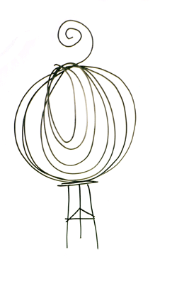 Introducing the Onion Union, a new online journal edited by
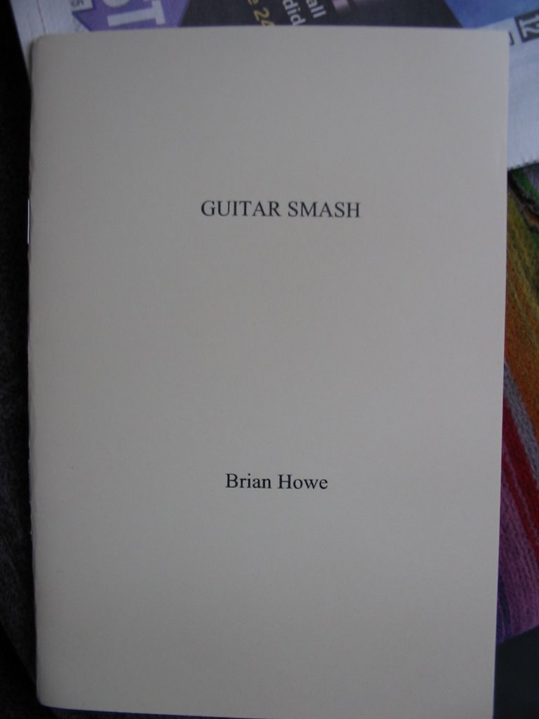 Brian Howe's chapbook Guitar Smash is out too.
 Logan Ryan Smith reviews Parad e R ain by Michael Koshkin
 New! Beat Roots by Anne Waldman, with illustrations by George Schneeman, from Hot Whiskey Press
 And finally, CAConrad's Mooncalf Press offers a new chap by Frank Sherlock

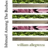 Free poetry--for FREE!--from Bill Allegrezza & Dusie
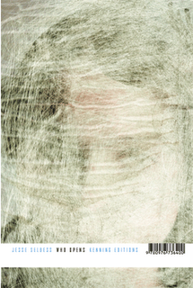 Kenning Editions recently released their first perfect-bound book!
 The fruits of NaPoWriMo are juicy & variously colored!


